I Tried Dark Moody Interiors — Here's What Works
I Tried Dark Moody Interiors — Here's What Works
Key Takeaways:
- Dark moody interiors are 2026's defining trend — driven by a cultural shift away from sterile minimalism toward warmth and drama
- Success depends on texture layering and contrast, not just dark paint — charcoal + gold, navy + brass, and forest green + copper are three proven palettes
- Strategic lighting is non-negotiable: warm-toned table lamps beat overhead fixtures in moody rooms
- The biggest mistake is going too uniform — dark rooms need lighter anchor pieces to feel intentional, not accidental
- AI room design tools let you test dark palettes on your actual space before committing to a single paint swatch
Why Is Everyone Suddenly Going Dark?
Something shifted in interior design around 2025, and by 2026 the evidence is everywhere. The all-white kitchen, the beige living room, the pale Scandinavian bedroom — they're not gone, but they're no longer the default aspiration. In their place, something richer and more deliberate has taken hold. Dark moody interiors are defining how people want their homes to feel right now.
The reasons go deeper than trend cycles. After years of stark minimalism — spaces that looked beautiful in photos but felt cold to actually live in — people are craving rooms that wrap around them. Dark colours do something psychologically interesting: they create a sense of enclosure without confinement, like a favourite restaurant where the dim lighting makes conversation feel more intimate. Interior designers are calling it the "Wuthering Heights effect," inspired partly by the dramatic interiors in Margot Robbie's 2026 adaptation, but mostly by a genuine appetite for spaces with emotional weight.
There's a practical angle too. Dark rooms are more forgiving than light ones. Scuffs, wear marks, and the general entropy of daily life blend into deep tones rather than standing out against pristine white. For anyone who's spent a Saturday afternoon touching up baseboards, that alone might be reason enough to make the switch.
What Makes a Dark Room Feel Warm Instead of Gloomy?
Here's the fear that stops most people: "I'll paint my walls charcoal and it'll feel like a cave." It's a reasonable concern, and it's exactly what happens when you approach dark interiors as a single decision rather than a layered system. The difference between a room that feels moody and inviting versus one that feels oppressive comes down to three things: texture, contrast, and light.
Texture is the secret ingredient that most advice overlooks. A dark room with flat, uniform surfaces — matte walls, smooth leather, lacquered furniture — can feel lifeless. But introduce velvet cushions against a linen sofa, a raw wood coffee table on a plush rug, brass light fixtures catching the glow of candles, and suddenly those same dark walls become a backdrop for richness. Your eye has somewhere to travel. In a dark palette, texture does the work that colour variety does in lighter schemes.
Contrast matters just as much. The goal isn't to make everything dark — it's to make the darkness intentional by giving it something to play against. A living room with black and gold accents against white trim demonstrates this perfectly: the dark elements feel dramatic precisely because the lighter pieces frame them. Think of it like a photograph — deep shadows only look stunning when there are highlights to balance them.
Which Dark Colour Palettes Actually Work in Real Homes?
Not all dark palettes are created equal, and the one you choose should match both your room and your temperament. After studying hundreds of AI-generated room transformations, three combinations stand out as consistently successful across different room types and sizes.
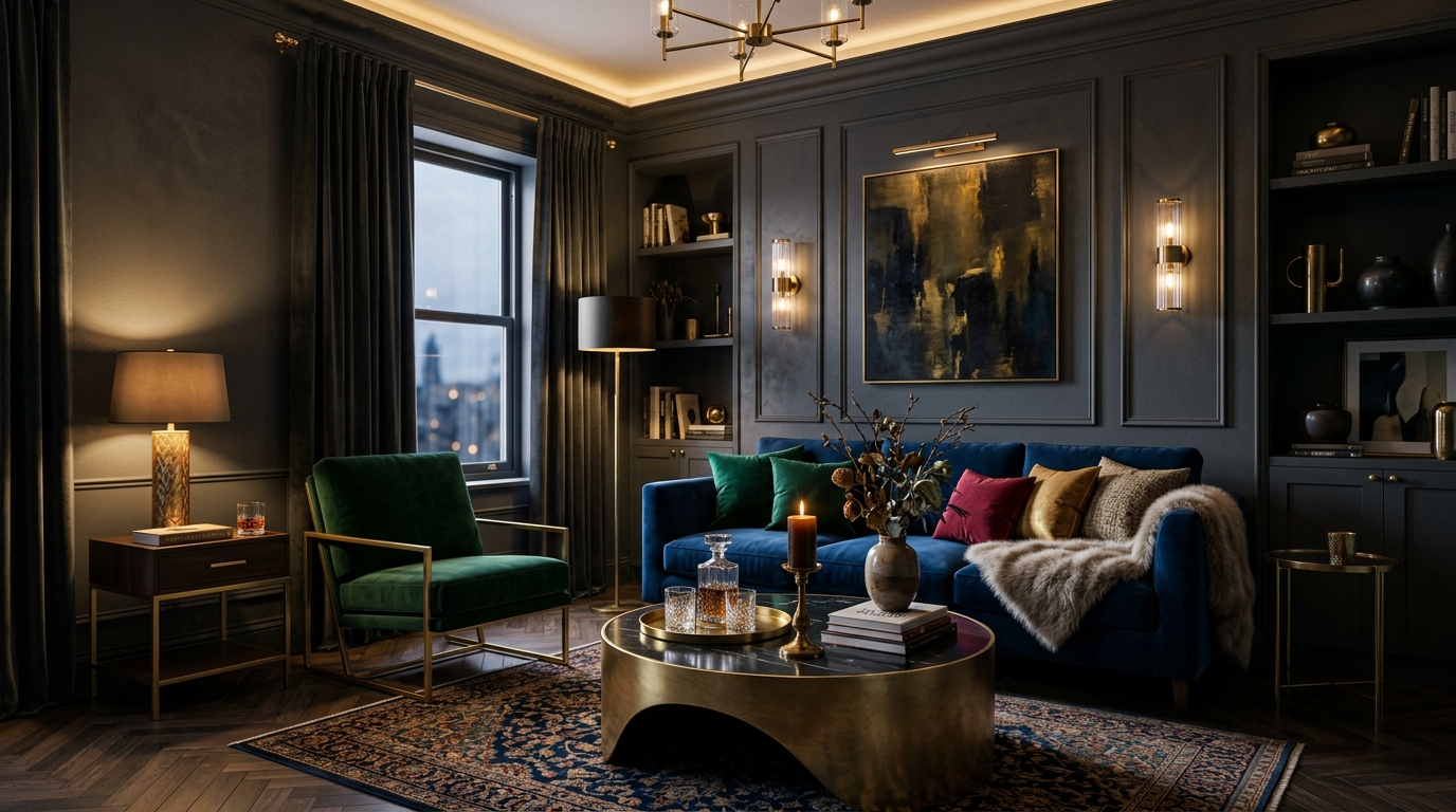
Charcoal + Gold: The Elegant Safe Bet
If you're new to dark interiors, this is where to start. Charcoal is warmer and more forgiving than pure black — it reads as sophisticated without feeling aggressive. Pair it with gold or brass accents (light fixtures, picture frames, hardware) and you get instant warmth. The gold catches whatever light exists in the room and amplifies it, preventing that flat, heavy feeling. This palette works beautifully in living rooms and bedrooms, as you can see in this Art Deco living room transformation in charcoal and grey tones.
For furniture, think cream or off-white upholstery against charcoal walls. The contrast is striking without being jarring. Add a walnut or dark oak side table and you've built a room that photographs as well as it feels to sit in on a rainy evening.
Navy + Brass: Deep Without Dramatic
Navy is the dark colour that people who think they don't like dark rooms end up loving. It has depth without heaviness, formality without stiffness. Paired with brass hardware and warm leather, a navy room feels like a well-loved library — the kind of space where you'd want to read, drink coffee, or have a long conversation. A navy and burnt orange home office redesign shows how this palette creates focus without feeling closed in.
Navy also plays well with more colours than you'd expect. It's a neutral in disguise — pair it with blush pink for unexpected softness, mustard for energy, or forest green for a nature-inspired richness. It's the most versatile entry point into moody design.
Forest Green + Copper: The Nature-Inflected Mood
For those drawn to organic warmth rather than urban sophistication, dark green anchored by copper or terracotta is extraordinary. This palette connects moody interiors to the natural world — think moss-covered stone walls, aged copper roofs, the deep green of old-growth forests. It's a distinctly atmospheric approach that works particularly well in dining rooms and kitchens, where the warmth of copper and the earthiness of green make gatherings feel special.
The trick with green is to go deeper than you think you should. A timid sage can look faded or indecisive against dark furniture. Commit to forest, emerald, or hunter green, and pair it with natural materials: rattan, raw wood, unglazed ceramics. The result is grounding in a way that purely cool-toned dark palettes aren't.
Dark Colour Palette Comparison: Which One Suits Your Space?
| Palette | Best Rooms | Mood | Difficulty Level | Key Accent Materials |
|---|---|---|---|---|
| Charcoal + Gold | Living room, bedroom | Elegant, warm, sophisticated | Beginner-friendly | Brass hardware, cream textiles, walnut wood |
| Navy + Brass | Home office, library, living room | Deep, focused, versatile | Beginner-friendly | Warm leather, mustard accents, aged brass |
| Forest Green + Copper | Dining room, kitchen, bedroom | Organic, grounded, earthy | Intermediate | Rattan, terracotta, raw wood, ceramics |
| Black + White + Gold | Living room, entryway | Bold, dramatic, high-contrast | Advanced | Marble, glass, gold fixtures, velvet |
| Plum + Dusty Rose | Bedroom, bathroom | Romantic, cocooning, luxurious | Intermediate | Silk, brushed nickel, blush linen |
How Do You Light a Dark Room Without Ruining the Mood?
Lighting is where most moody room attempts either succeed or fail, and the instinct most people have — adding more overhead light — is exactly wrong. Bright overhead lighting in a dark room creates an interrogation-room effect, washing out the richness you worked to create while casting harsh shadows on every surface. The whole point of a moody palette is atmosphere, and atmosphere requires intentional, layered lighting.
Start by thinking in terms of three layers. Your ambient layer should be warm and diffused — think wall sconces, a statement pendant on a dimmer, or recessed lighting at low intensity. Your task layer covers the practical stuff: a reading lamp by the sofa, under-cabinet lights in the kitchen, a desk lamp in the office. And your accent layer — this is where the magic happens — includes candles, LED strip lights behind shelving, and table lamps with warm-toned shades that create pools of golden light.
The colour temperature of your bulbs matters enormously. In a dark room, 2700K bulbs (warm white) make everything look rich and inviting. Cooler bulbs — 4000K and above — make dark walls look grey and flat. This is a cheap fix that makes a dramatic difference, and it's the single most impactful change you can make before touching paint or furniture.
Reflective surfaces amplify what light you have. A Gothic bedroom in charcoal, silver, and dove grey uses metallic accents and mirrors to bounce light around the space, proving that dark rooms don't need to sacrifice brightness — they just distribute it differently.
What Are the Biggest Mistakes People Make With Dark Interiors?
The most common mistake is going too uniform. A room where the walls, floor, furniture, and textiles are all the same darkness doesn't look cohesive — it looks like someone forgot to turn the lights on. Dark interiors need a range within the dark spectrum: combine deep charcoal walls with a slightly lighter grey sofa, a walnut table that reads as warm brown, and metallic accents that catch the eye. The variety within the darkness is what creates visual interest.
The second mistake is neglecting the ceiling. A dark room with a white ceiling creates a jarring line where walls meet overhead — your eye gets drawn up to the contrast rather than settling into the room. Many designers now recommend painting the ceiling the same colour as the walls, or at least a softer version of it. This "colour drenching" technique creates that enveloping feeling that makes dark rooms so compelling. It sounds counterintuitive, but eliminating the stark ceiling line actually makes the room feel larger because boundaries dissolve.
Third: forgetting about the floor. A dark room with light oak or pale tile flooring can feel disconnected, like the walls and floor belong to different houses. This doesn't mean you need black flooring — a medium-toned rug, a warm wood stain, or even a patterned rug that bridges your light and dark elements creates coherence. The contemporary kitchen in dark brown and charcoal demonstrates how warm wood tones on the floor anchor dark cabinetry beautifully.
Can AI Help You Test Dark Designs Before Committing?
Here's the real challenge with moody interiors: they're hard to imagine from paint swatches. A 2-inch square of charcoal on a card looks nothing like four walls of charcoal surrounding your furniture. And unlike a white room — where mistakes are easy to correct — dark paint is harder to cover, more expensive to change, and more emotionally daunting to commit to.
This is where AI room design tools become genuinely useful rather than just a novelty. Upload a photo of your actual room — your furniture, your lighting, your proportions — and see it transformed into a dark palette within seconds. Not a generic render, but your space reimagined. Want to compare charcoal Art Deco against navy Industrial? Generate both and see which one your gut responds to.
The value isn't just aesthetic — it's financial. A full room repaint costs hundreds in materials alone, plus the time and effort of doing it (or the thousands of paying someone else to). Seeing your room in a moody palette before buying a single can of paint means you commit with confidence rather than crossing your fingers. Several of the dramatic industrial transformations in our gallery started as exactly this kind of "what if" experiment.
Which Rooms Work Best for a Dark Moody Makeover?
Living rooms are the natural starting point. They're where you spend evenings, entertain guests, and actually experience the atmosphere you've created. A dark living room with layered lighting and rich textiles becomes the kind of space people don't want to leave. It's also the room where you have the most flexibility with furniture and accessories, making it easier to build the contrast and texture layers that moody design requires.
Bedrooms are a close second — and in some ways even better suited. A bedroom in deep charcoal with silver accents creates exactly the cocooning effect that promotes good sleep. Dark colours suppress visual stimulation, which is precisely what you want in the room where you're trying to wind down. If you've been staring at bright white walls from your pillow, a moody bedroom might be the most impactful change you make this year.
Home offices deserve a mention too. Dark walls behind a desk create focus by reducing visual distractions at the periphery — there's a reason that theatres and cinemas are dark. A navy or charcoal office with warm brass desk accessories feels serious without being corporate, creative without being chaotic.
Kitchens are the one room where caution is warranted. Dark cabinets and countertops can look stunning, but kitchens need functional light for cooking and food prep. The best approach is contrast: dark lower cabinets with lighter upper cabinets or open shelving, good task lighting, and a lighter backsplash that bounces light where you need it.
Frequently Asked Questions
Won't dark walls make my room feel smaller?
Not necessarily. Dark walls can actually blur the boundaries of a room, making it harder for the eye to pinpoint where walls end. The key is strategic lighting and contrast — a dark room with well-placed lamps, lighter furniture, and reflective surfaces (brass, mirrors, glass) can feel surprisingly spacious and enveloping rather than cramped.
What's the best dark colour palette for beginners?
Start with charcoal and warm gold accents. Charcoal is more forgiving than pure black — it reads as sophisticated without feeling harsh. Pair it with brass hardware, warm wood tones, and cream textiles. This combination works in almost any room and is hard to get wrong.
Can I do moody design in a rental apartment?
Absolutely. You don't need to paint walls to achieve a moody look. Dark curtains, deep-toned bedding, a statement rug in charcoal or navy, and moody artwork can transform a space. Removable wallpaper is another great option. Focus on textiles and accessories that you can take with you.
How do I prevent a dark room from feeling depressing?
The difference between "moody" and "gloomy" comes down to warmth and variety. Layer at least three different textures (velvet, wood, metal), include warm-toned lighting (2700K bulbs), and make sure there's enough contrast between dark and light elements. A room that's uniformly dark feels oppressive; a room with dark walls and lighter furniture feels intentional and cozy.
Does moody interior design work in every room?
It works best in living rooms, bedrooms, dining rooms, and home offices — spaces where you want atmosphere and focus. Kitchens and bathrooms can handle moody accents but benefit from more light and contrast. Start with the room where you spend your evenings; that's where a dark palette truly shines.
Curious how your room would look in a moodier palette? Upload a photo and see your space transformed — you might discover that the dark side was the right side all along.